 Printwear & Promotion The Total Promotional Package
 Recreating a design in print or embroidery is a challenge, and lettering often presents complications of its own. SARA MCDONNELL talks to embroidery and print experts to find out what these challenges are and how they might be tackled.
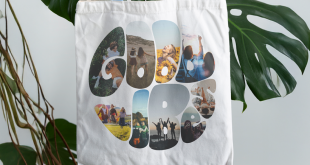
Logos are created to convey a brand message both literally and visually – through what it says and how it looks. Therefore the style of lettering used in a logo is likely to be as important as what the words themselves say. So if you’re printing or embroidering that lettering, it’s important to get the look of it right and be sensitive to the original design.
It’s the designer’s priority, of course, to make a great-looking design that conveys the message of the brand. He or she will not always consider the technical difficulties of reproducing it on a garment. It’s up to the printers and embroiderers themselves to ensure that they – and their customers – know what limitations they’re working in so that expectations can be managed accordingly.
Lettering as part of the design
If there is lettering involved in a design, the digitiser/screen maker/digital printer will need to either use an off the shelf lettering (otherwise known as a font) that their software package recognises, or redraw the letters as separate shapes.
Certain fonts will be more difficult to reproduce than others, in some cases because it’s not a commonly used font that is easily reproduced, or in others because the font itself can be difficult to reproduce in a way that is readable (for example if the size of the font is very small).
Other key factors to bear in mind are whether you are printing or embroidering, which method you are using and what substrate you are printing onto.
Embroidering fonts
When done correctly, embroidered text can create a long-lasting and effective branding on a garment such as a cap or polo shirt. However, there are limitations when it comes to embroidering lettering, especially serif fonts, as Stephen Gilbert of Your Embroidery Services Ltd explains: “It’s not because of the serifs themselves, but often because the line of the font can get very thin at certain points in the letter. For example, a 20mm high letter ‘s’ in a Times font can get as thin as 1mm at the bottom of the curve.”
This produces challenges for the digitiser because while the minimum movement for an embroidery machine is one tenth of a millimetre, the minimum length of stitch possible is often defined by the density and stitching of the fabric. Is there enough fabric between stitches to prevent the thread snapping, for example? Is the fabric woven or knitted? Woven fabrics support thin stitching better than knitted. “The thickness of the thread is also a factor,” Stephen adds. “If you have a thread that is 0.4mm wide, you simply don’t have the room to make a stitch smaller than 1mm.”
As a rough guide, Stephen recommends a minimum 5mm height for a block font capital letter, and 10mm for a serif font.
Printing fonts
There are fewer limitations on screen printing lettering, meaning that printers can achieve a smaller font size than embroiderers. But just how small can you go? “The minimum size of font you can achieve with screenprinting is subject to several variables” explains Andrew Stocking of Dalesway Print Technology. “Some of these variables include: the quality of the artwork used to produce the film positive, the method of producing the film positive (image setter, RIP and inkjet, inkjet or laser printer without RIP to name a few), the mesh count of the screen, the type of ink used, the type of emulsion used to coat the screen (which is dictated by the ink being used), the overall EOM (emulsion over mesh) achieved and even the type of squeegee blade used to push the ink through the screen.”
If all the above factors are aligned correctly, Andrew says, then very fine detail can be screen printed. “The fact that complex CMYK half tone dots can be successfully screen printed to provide beautiful full colour images is testimony to the ability of the process to manage detailed resolution,” he adds.
Other factors to take into account
Even if technically, you can print the font on your substrate comfortably, there is still the issue of whether you have the font in the first place. Most software packages will have the most common fonts, but what about more individual lettering? In some cases it may be easier to simply treat the font as a shape to be recreated as vector artwork. However, care needs to be taken when digitizing these shapes, as the brain will often read letters differently to something that is simply a shape. As Stephen says, “a computer will be able to redraw a shape but it can’t tell whether it looks good. For that you need human eyes to make that judgement.”
Substituting fonts
Sometimes it’s just not possible to find the source font, or the cost of buying it is prohibitive. In these cases it might be a better option to substitute a font with a stock font than try to recreate it. With increasing banks of fonts, many software packages make it easier than ever to substitute a font. But be careful, Stephen warns: “People recognise lettering and it may be harder than you think to match it.”
Finding non-stock fonts
Sometimes you might need to buy in fonts that are not part of the stock fonts in your software. There are websites that have these fonts all in one place, such as www.myfonts.com. You do have to pay for these, however. Andrew recommends that you should only use bona fide websites that sell fonts. “Free fonts may well come packaged with more than you bargained for in the form of viruses and other nasties,” he says.
Recreating a design for print or embroidery may well need some compromise on behalf of the designer/client. However, if the limitations are recognised and accounted for when transferring the design to a garment, there should be a way of recreating a logo that looks good, both in terms of the design and the execution of it.
Lettering and some technical terms explained
What is a font?
Sometimes known as a typeface, a font is a style of lettering that is used in print and, more often than not these days, digitally. Most fonts will have a certain template for every letter, capital letter, number and punctuation mark in common use. They will usually have specific marks, such as the symbol for degrees centigrade, pounds sterling and percentages (these are sometimes referred to as glyphs), although some don’t, so make sure your chosen font has all of the marks that you will be using.
What kinds of fonts are there?
Serif fonts: Serif fonts are the fonts that have little barbs, or serifs, attached to the lettering. They are generally used in body text in printed magazines, newspapers and books and are considered by some to be the easiest to read (although there are those who disagree). Examples of serif fonts include: Garamond, Times and Times New Roman.
Non-serif or sans serif fonts: Non-serif fonts are plainer than serif fonts and are commonly used on internet web pages and as headings. Common examples of non-serif fonts are Arial, Verdana and Helvetica.
Dingbats
These are little symbols or shapes that are designed to be used with a particular typeface.
Type styles
Each font might be split into a family of different fonts that are similar in style but serve different purposes. Roman usually refers to the basic type style in a particular family. Italic is a more slanted version, designed to look a little more like handwriting. Condensed/thin type is usually a narrower version of the main font and generally used when space is tight. Light, bold and extra bold are other versions of the font that give less or more emphasis as required.
Kerning
Kerning refers to the space between the lettering. A well-designed font will make sure there is the optimum amount of space between each letter, however, some software packages allow designers to adjust the kerning to fit the lettering better around a design.
Vector vs rasterised artwork
A vector image is one that is drawn; it will trace the path of the edges of the shapes. A rasterised image such as a jpeg will convert the image into a series of coloured pixels and is usually how a photograph is stored. Logos and letters are often better stored in a vector format to avoid the pixellating effect if a font is blown-up to a larger size.