 Printwear & Promotion The Total Promotional Package
Jason Chapman, director of operations at The Regency Group, New York, provides some expert advice on how to combat moiré and achieve the perfect gradient.
Moiré in screen printing refers to an undesirable visual interference pattern that occurs when two or more grids, patterns, or halftone screens overlap at slightly mismatched angles or frequencies.
This can result in wavy, swirly, or repetitive patterns that distort the intended design.
 But what are the causes of moiré?
- Halftone screen angles: In screen printing, images are often converted to halftones (dots of varying sizes) to simulate gradients. Moiré arises when the angles of the halftone screens used for different colours are not properly aligned or are too similar.
- Mesh and halftone interaction: The screen mesh itself has a grid structure. If the frequency (lines per inch, LPI) of the halftone dots clashes with the mesh count (threads per inch), moiré patterns can occur. Thread thickness also plays a major part.
- Improper overlapping of layers: Layers or separations in multi-colour printing that don’t align properly may lead to moiré. This is well known in the printing of process colours CMYK where each colour needs to be made at a different angle. However, moiré also appears on basic gradients and can be an annoying thing if the causes are not understood.
- Scanning or digital file issues: Patterns in scanned images or digital designs, such as fabrics or printed textures, can introduce moiré during the screen preparation process.
To minimise moiré, it is advised that you use correct screen angles. Ensure proper angular separation between the screens of each colour (e.g. standard angles: Cyan = 15°, Magenta = 75°, Yellow = 0°, Black = 45° for CMYK printing).
You should also do the following:
- Match mesh count with halftone frequency: Select a mesh count that complements the LPI of the halftone dots to minimise
- Adjust design elements: Avoid using very fine patterns or repetitive elements that might clash with the halftone screen.
- Test printing: Conduct test prints to identify and adjust for any potential moiré issues before full production.
- Digital solutions: Use software tools to adjust the angles and frequencies of halftones during prepress preparation.
- Moiré patterns can significantly affect the quality of a print, so identifying and mitigating them during the design and preparation stages is crucial for achieving professional results.
While there are lots of opinions on achieving the perfect gradient in the industry, I will share some that have produced some terrific prints for me over the years.
Spot colour gradients using water-based inks on black substrates
One of my most famous prints is the ‘Smoking Gentleman’ which was a complicated print and a great example to use and ensure each screen is moiré free. It combines several techniques such as four base layers – white 1, white 2, white 3 and cool gray 8c. You may ask why so many screens? While a general T shirt printer may use one or two base screens, which is fine, my goal here was to create different levels of white and gray to differentiate the background shades from the hair and smoke while creating the base for the colours. The other reason was to use maximum of two flash cures.
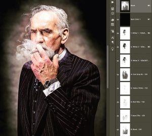 On the separation’s below you can see ‘120’ on each channel. This refers to a 120 mesh (305) for every colour including the bases. The dot size used was 90. Both these parameters may seem scary to a novice printer, especially using water-based inks. However, we can touch on the printing elements later, for now, we will concentrate of pre-press and screen preparation.
Looking at the perfect angle
Below is a basic representation of how angle affects moiré (and this is only one cause).
I have placed a mesh grid in white over the top of the gradients at different angles on the top two gradients only. The first (0°) represents the screen mesh being stretch perfectly square to the screen frame. Then 22.5°and 45° have the frame rotated at these angles.
To see the effect each angle has on the gradient, you will need to zoom in and out depending on your monitor/device resolution.
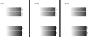
- 0° should show a slight square grid.
- 5° shows little or no moiré.
- 45°will show a slight criss-cross effect.
The different patterns are created by the screen thread hiding parts of the dots, especially the finer dots. The interaction of the screen mesh angle and the angle of the dots created on film (in this case 0°angle on film in all three cases) determine how much of the gradient falls in the mesh holes where ink passes through.
Thread thickness or diameter
To exaggerate the moiré, I have increased the thread thickness (diameter) of the mesh by 50%. Below you can see how thread thickness alone can have an impact on the level of moiré.
 All three angles are now being affected by the thread thickness. While thread thickness on a 120 mesh becomes less of a concern, on meshes such as 43, 62 or 77 thread diameter, does need consideration.
So what did I use?
The print here was a spot colour separation and not CMYK, I used 22.5°on all screens. 22.5° is my go-to angle for all spot colour gradients. However, the angle is created at film output, and not by the screen mesh. This allows me to always stretch screen mesh square to the frame and eliminating waste.
Is there a perfect formula?
Standardising everything you do from outputting films, screen stretching to ink viscosity and squeegee impacts results. The more consistent you are, the better understanding of how each part of the process affects results. The scientific formulas only work if all other elements are consistent and correct.
Practice, experiment and enjoy!


